CapCut Logo Meaning & Design Explained | Branding, Symbolism, and Simplicity
The CapCut logo isn’t just a plain black-and-white design; it’s a clever symbol of creativity and simplicity. In this article, you’ll discover the meaning, design choices, and branding strategy that make it one of the most recognizable icons in video editing.
Introduction to CapCut Logo
A logo goes beyond being a graphic; it serves as the voice and identity of a brand in visual form. When people see the Apple logo, Nike’s swoosh, or YouTube’s play button, recognition is instant. CapCut, the free video editing app by ByteDance, also follows this path. Its logo is clean, minimal, and highly memorable. But what does the CapCut logo really mean, and why does its simplicity work so well? Let’s explore the design, symbolism, and branding strategy behind the CapCut icon.
What is CapCut?
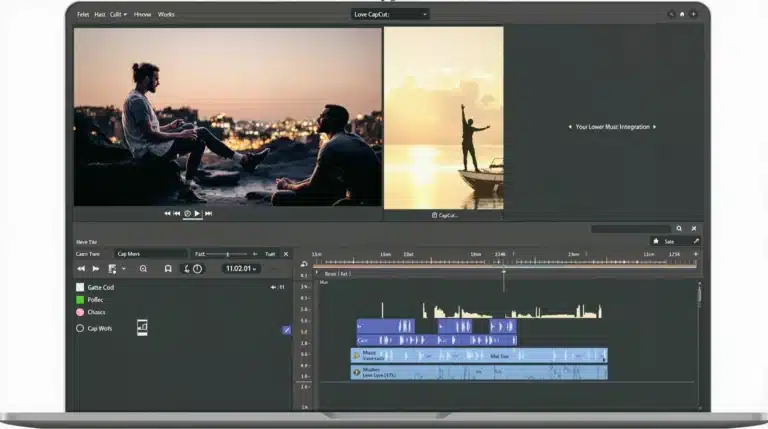
CapCut is a free all-in-one video editing app available on Android, iOS, and CapCut for PC. Created by ByteDance, the company behind TikTok, it’s designed to help creators make polished content with ease. With features like trimming, transitions, AI tools, and effects, it’s become the go-to app for TikTokers, YouTubers, and social media creators. Its branding, including the CapCut logo design, plays a big role in building trust and recognition worldwide.
First Impressions of the CapCut Logo
When users open the app, the CapCut logo immediately stands out. It’s simple yet powerful: black lines forming an “X” shape, paired with clean typography. While many editing tools use vibrant, colorful logos, CapCut keeps it minimal, symbolizing its focus on simple and clear editing.
The Core Design of the CapCut Logo
The CapCut app logo combines two elements:
- The symbol – a stylized “X” with sharp, intersecting lines.
- The wordmark – a bold, sans-serif font that reads “CapCut.”
This balance makes it versatile across platforms, whether it’s displayed on the Google Play Store, App Store, or within the app itself.
Symbolism Behind the Logo
The CapCut logo’s central “X-like” shape symbolizes cutting, trimming, and editing video clips. It’s a subtle nod to scissors and film reels, directly linking the logo’s meaning to the app’s main purpose. Such a design approach makes the logo appealing while also serving its purpose of clearly expressing the brand’s identity.
Typography and Font Choices
CapCut uses a clean sans-serif font alongside its symbol. The typography is bold, simple, and highly readable. In a fast-paced digital environment, this ensures users can instantly recognize the CapCut brand name without confusion.
Color Psychology in the CapCut Logo
Why black and white? The color scheme reflects:
- Black: authority, professionalism, and sophistication.
- White: clarity, simplicity, and openness.
This absence of bright colors gives the logo a timeless, minimalist design that works across cultures and devices.
The Concept of Powerful Simplicity
CapCut demonstrates that less is more. Instead of overloading the logo with flashy details, it sticks to strong, clear lines. This approach mirrors brands like Apple and Google, whose minimalist logos have become global icons. CapCut’s branding follows the same philosophy.
CapCut Logo Evolution
Since its launch, the CapCut icon has stayed consistent with only minor refinements. Unlike other apps that change logos often, CapCut’s stability builds trust and long-term recognition among users. You can check the CapCut APK Download page to see how the logo appears in the latest app versions.
Why the CapCut Logo Works Globally
The minimalist style is culturally neutral. Unlike logos tied to specific colors or cultural symbols, the CapCut logo speaks a universal design language. Whether you’re in the U.S., Europe, or Asia, its meaning remains the same—cutting videos simply and effectively.
CapCut’s Branding Strategy
The CapCut brand identity is built around accessibility and creativity. Its logo mirrors this by being:
- Simple – just like the app’s editing tools.
- Professional – reflecting high-quality output.
- Universal – appealing to creators everywhere.
If you want to unlock more creative options, check out CapCut Pro APK, which extends the brand’s promise with advanced features.
Comparison with Competitors’ Logos
- InShot: uses bright colors and a camera icon, which can feel cluttered.
- KineMaster: circular design with details that may not scale well.
- Adobe Premiere Rush: sleek but more corporate.
CapCut’s minimalist black-and-white icon makes it more flexible and professional, especially for today’s fast-moving creator market. For those who want extended functionality, CapCut Mod APK offers even more editing freedom.
Psychological Impact on Users
Logos shape how users feel about a brand. CapCut’s simple logo builds trust, reduces overwhelm, and creates a sense of ease. This psychological effect reinforces the app’s identity as user-friendly and reliable.
How the Logo Reflects the App’s Purpose
CapCut is about speed, creativity, and efficiency. Its logo reflects exactly that: quick cuts, clean design, and no distractions. CapCut’s branding grows stronger through the harmony between its logo and what the app delivers.
The Future of the CapCut Logo
Minimalist logos rarely go out of style. While small tweaks might happen, the core design will likely remain unchanged. The logo’s straightforward design gives it a lasting presence, making it future-ready.
Conclusion
The CapCut logo shows that powerful branding doesn’t require complexity. With a black-and-white minimalist design, a symbolic “cutting” icon, and universal appeal, it represents exactly what the app delivers—simple yet powerful video editing. As CapCut grows globally, its logo will continue to be a timeless part of its identity. To try it yourself, Download CapCut App and see the logo in action.
FAQs
1. What does the CapCut logo mean?
It represents video cutting and editing, symbolized by the intersecting “X” shape resembling scissors or film cuts.
2. Why is the CapCut logo black and white?
Black and white reflect simplicity, professionalism, and clarity, making the logo adaptable across different platforms.
3. Has the CapCut logo ever changed?
The logo has remained consistent with only minor refinements, ensuring stability and recognition.
4. Who designed the CapCut logo?
While ByteDance hasn’t disclosed the designer, it was created to align with the app’s minimalist branding strategy.
5. How does the CapCut logo compare to TikTok’s logo?
TikTok’s logo is colorful and playful, while CapCut’s is simple and professional, focusing on video editing rather than entertainment.